3D Rad - Free 3D game maker - Forum

This forum is now archived!

This forum is locked, and is a read-only version. A new community-ran forum can be found at classdev.net

News:

The 3DRad community can be found at classdev.net.

Pages: 1 [2] 3 4 ... 7

Author Topic: 2 Day Artists' Challenge -  (Read 1682 times)

« Reply #15 on: March 23, 2014, 03:37:51 AM »
Hey guys, would people mind me putting in a late entry tomorrow evening? (about 20 hours away for me)
« Reply #16 on: March 23, 2014, 11:39:43 AM »
sure G... all entrants welcomed...

so far we've gotten some pretty good looking contributions...
overall, i like Cyper's 3DRAD image best... closest to the example, and it has "life" to it...

the right amount of bumpmapping and glossiness... not too plasticy or wet looking...

very well done with 3DRAD's limitations... it looks like it could be part of a sellable game...

my submission is a lil flat... in order to get the look i really like i'd have to split the mesh up more, and
still i'd only have one light for the meshes... which means i'd have to split the mesh up even more to
get a lit hallway (cubemapping over bumpmapped and lightmapped surfaces)...


--Mike
« Last Edit: March 23, 2014, 11:46:50 AM by Mike Hense »
« Reply #17 on: March 23, 2014, 01:17:44 PM »
Joseuz and Mike - you clearly have many techniques in use there that are a mystery to me, the lighting/shadows are epic.
Heat - you've definitely used the basic techniques like I have, and there's nothing wrong with that if you get something that works
The thing I find with many games/graphical images is that everything's so shiny, life isn't like that, walls don't reflect like mirrors, cars don't show every reflection in detail.

All textures in mine are drawn from scratch, I think that helps in getting the image you want rather than working within someone else's constraints and you can build in the shading you want (although this was very quickly done here), what I've done comes nowhere near to any Rad imposed limitation and is merely 3 textured/bumpmapped meshes and a pointlight

Good stuff everyone and these could easily be put into a decent horror/shooter game to challenge other engines if well applied
« Reply #18 on: March 23, 2014, 06:30:12 PM »
Hey, sorry another late submission, got my netbook back for an hour so done this up quickly, i had some ideas in mind but they didn't work very well, i think i went way to dark and unfortunately a lot of my details were lost upon compiling specifically the ones outlined in red but hey ill know for next time lol
« Reply #19 on: March 24, 2014, 03:29:40 AM »
Heat:
Pros: stay a nice effect
Cons: too much reflection, as if the walls were waxed
Recommendation: you can use a lamp in the corner to the light of the walls have a better effect

Cyper:
Pros: excellent lighting, good details, appropriate use of normalmaping
Cons: ceiling texture do not match the scene
Recommendation: add details to the roof or something that differentiates the walls from the ceiling example: a cable

Mike
Pros: good lighting the walls, floor, and roof match
Cons: I see no cons
Recommendation: use normal maps

Danipren
Pros: has a good atmosphere of terror
Cons: the roof has no lighting, I think no roof
Recommendation: slightly obscure texture ceiling carter

Joseuz
Pros: you tell me
Cons: you tell me
Recommendation: you tell me  :D
my strength is the texturing and graphics
« Reply #20 on: March 24, 2014, 04:26:23 AM »
ye your right no roof Ive been working on top down games too long forgot that interiors have roofs lol I'm really not happy with the results especially with all the disappearing details and doors
« Reply #21 on: March 24, 2014, 05:01:07 AM »
Hey Guys, this is what I managed to put together:


It's not as good as the other stuff here, but I enjoyed putting it together. Rather than trying to match the original image as closely as possible, I instead tried to make a scene that was comparable graphically.

I don't think I even came close! Regardless, I'm still pretty pleased with my efforts.

I wish I could have lightmapped the whole scene, but I'm still getting my head around Giles at the moment  :P

Cheers,


George
« Reply #22 on: March 24, 2014, 06:52:27 AM »
two interesting additions to the challenge... thanks guys for joining the discourse...

Dan... maybe a lil too dark, but very close to the original spec... i had the same issues with RAD when trying to do what i originally wanted to do... hey, this is what the discussion is about... to help each other improve our 3DRAD skills a lil (more on that in a while)...

Georgio... i'm also impressed with your departure from the nuvo realism of dirty, gritty surface textures for a more architectural walkthru, cleaner approach...  and the attention to detail is what i think differentiates a scene AAA scene in a game from the rest of the crowd... those doors look like someone is about to push one open at any second (like in the early America's Army hospital training level)...


questions:

Cyper...
  how'd you do the weathering on your walls... detailing and getting the right mix of textures is, i think, a key part of making
  believable scenes... and is also one of my big problems...

Georgio...
  i'm glad you decided to post this at the last moment... i've never been able to get this sorta scenery style to work...  a lil
  explanation on how you get that clean look... how'd you do the texture mapping and the soft lighting...

everyone:
  do you tile texture squares or do you paint in a large uvmap...


--Mike

« Last Edit: March 24, 2014, 07:40:30 AM by Mike Hense »
« Reply #23 on: March 24, 2014, 01:20:17 PM »
tile texture squares
my strength is the texturing and graphics
« Reply #24 on: March 24, 2014, 01:44:56 PM »
I used one uv map.

And I do think I used too much shiny bump map effect.

I think these type of contests help make our games better, and the 3drad fourms get a lot from these posts.
All of you did a good job!
« Reply #25 on: March 24, 2014, 01:58:52 PM »
Cyper...
  how'd you do the weathering on your walls... detailing and getting the right mix of textures is, i think, a key part of making
  believable scenes... and is also one of my big problems...

I used to 'borrow' textures a lot but when Grim and I decided to get more serious he photographed every surface in his office building during his lunch break, this gave us a huge library of custom resources all for an hours work (but he is a professional cameraman with kit that costs more than a family car so you may not be able to match his quality!). Playing with these in Paint.net can give you loads of weird variations, for example a marble tile with colour inversion and a bit of a hue change is a dead ringer for rusted metal- see attached (that's a kitchen tile)

In this case though, drawn from scratch with Paint.net
for the weathered plaster bits -

draw a rough blank shape in black
select the shape and render a rough, small scaled cloud over the top
add a new layer and copy in the cloudy shape again over the top
on the top layer effects>stylize>emboss
select the layer properties and set to multiply and alter the opacity to taste
merge the layers
effects>dents  - low scale, med refraction, med roughness, low tension (to taste)
add a new layer and paint in some black shadowing and white highlighting at opposite sides
blur then change layer opacity till it looks subtle
flatten the image
overlay on the wall texture

when combined with a subtle bumpmap it doesn't look too bad

I've found you can achieve a lot with paint.net using lots of layers, effects, practice and imagination - that full texture took about an hour from blank screen

As for tiling/uv my workflow is, as always, sketchup and paint.net, so projected textures which are technically UV'd but I re-position and re-use the same texture repeatedly

Sorry for the long winded reply, anyway I'm off back to the land of Unity.
Great having a quick catch up, I'm sure I'll pop back soon  ;D

...and great work everyone, the challenges bring out the best in you all, keep 'em up

« Last Edit: March 24, 2014, 02:01:30 PM by Cypermethrin »
« Reply #26 on: March 24, 2014, 02:39:22 PM »
I used a mix, for the large parts I used 2 seamless 512 then for the details I used smaller custom maps I made bump and spec maps but haven't figured out spec maps which wouldve made a big differance in this kinda scene will do another screenie later try get  the details back in
« Reply #27 on: March 24, 2014, 05:05:44 PM »
Quote
how'd you do the texture mapping and the soft lighting...

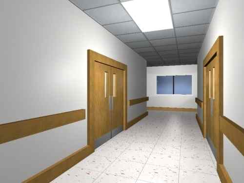
For the textures, I just used sketchup to place, scale and rotate them. Since I was only dealing with a fairly simple model, I didn't bother making any UV maps. Bumpmaps for all of the textures were made with SS bump generator (an excellent piece of free software, by the way)

In Rad I also set the mipmap LOD to a negative value, (-3 or -4) for most of the models to try and keep things looking sharp when viewed on an angle/at a distance.

The lighting was a little awkward. It makes use of a few point lights, and the technique probably wouldn't work as well applied to a larger scene. However, lightmapping could probably achieve the same effect.

The first thing I did was create a sunlight object and set it to pitch black. I only wanted light from the pointlights to affect the scene. One PL was placed near the light, another by the window and another behind the camera. These last two pointlights were intended to even out the lighting in the scene.

Every surface in my scene uses the same shader, the bumpy/glossy shader from the systemshader addon. I adjusted the bumpmap height and glossiness (and the reflection/refraction settings in the case of the floor)  for each surface until it looked right.

For the walls, I only used a tiny amount of glossiness, and a very subtle and noisy bumpmap texture to ensure that light from the PL 'scattered' when it hit that surface. I also had to set the PL light distance of the main light right down (10m or so) so that the walls didn't reflect bright white.

Compared to the default settings for the bumpy/glossy shader, all of these surfaces use way shallower bumpmapping and much less glossiness.

Anyway, that's the end of my rambling. Hopefully someone got something out of it.

I guess it's time for me to comment on other people's stuff...

Heat: Your scene is pretty glossy, but I think that's okay. Things like gloss and bloom tend to look 'realistic' in games even if they wouldn't in real life so much. The textures are also well bumpmapped (light reflects off the right parts of the texture etc.).

Joseuz: Your scene is definitely my favourite  :) I like the style, and the lighting and texturing are excellent. I guess the only problem I can see is the fact that the carpet is glossy when it should perhaps be more matte.

Cyper: Your Rad scene looks really good. Professional too. How did you light your scene?

Mike: I like the lighting in your scene. Pointlights or Lightmapped? The textures could be a little more detailed, but that's kind of a non-issue considering how easy it is to fix.

Danipren: You definitely have an eye for texturing and lighting your scene. The colours are nicely balanced with nothing appearing out of place.

I think that's all guys. This was fun; I hope there are more competitions like this in the future.

Cheers,

George


« Reply #28 on: March 24, 2014, 05:20:44 PM »
Quote
Heat: Your scene is pretty glossy, but I think that's okay. Things like gloss and bloom tend to look 'realistic' in games even if they wouldn't in real life so much. The textures are also well bumpmapped (light reflects off the right parts of the texture etc.).
I also use the same bump mapper. I had the bump mapping set too high.
« Reply #29 on: March 24, 2014, 05:47:03 PM »
My lighting was a bit sparse...1 pointpoint, 1 low level coloured sunlight and a bit of fog, shadowing on the ledges is in the texture

my summary now there all in...

Heat - a simple scene, too much gloss and bump, but practice and tweaking will get you there quickly
Joseuz - Voodoo lighting, still no idea how you do that, the scene looking down the corridor is worthy of AAA
Mike - your scenes always look great, they have a 'solid' quality to them
Georgio - I like that, the gloss levels are perfect
Dan - that could be nicely scary with some good sound and a bit of flicker on the distant light

Surprised you didn't enter DogT, thought this would be something you would go for.
Hope there'll be another challenge in the future
Pages: 1 [2] 3 4 ... 7